It happened. I updated one of my last machines, running Windows 8.1, to Windows 10. That means all my Windows OS machines, physical at least, are on the latest version of Microsoft’s ubiquitous OS. But, even as I was doing it, I was wondering to myself if it was even necessary. Also I was wondering if Windows 8 got way too much of a bad rep, perhaps unfairly. It certainly didn’t get off to a good start, and it never recovered from that. But the story of the successor to the much-loved Windows 7 is a catalogue of errors causing it to be much maligned, as Vista was.
Unlike Youtube videos, who love to drone on for a good few minutes before they actually get to the topic, then another 15 before they answer it, I’m saying ‘no’, Windows 8 wasn’t a bad OS at all. In many ways it was superior to the much loved Windows 7. In fact, it improved upon it’s predecessor in almost every area. Well… all except for one. And I’m sure we all know what that was. Windows 8 was a complete fail, on Microsoft’s part, to understand what the customer wanted, and their attempts to force a tablet like ‘experience’ on to the desktop.
I’m certainly not a die-hard Microsoft fan boy. I hated the 95/98/Me codebase and dug my heels in over a complete move from Amiga to PC until Windows 2000 came along. Back then, Windows became my main OS out of necessity more than choice. Linux wasn’t quite a viable alternative, at this stage. Neither were the various ‘fringe’ OSes, such as BeOS or QNX. If I used MacOS I’d have to boot in to Windows for games anyway. Using Windows gave me everything I needed without having to switch OS.
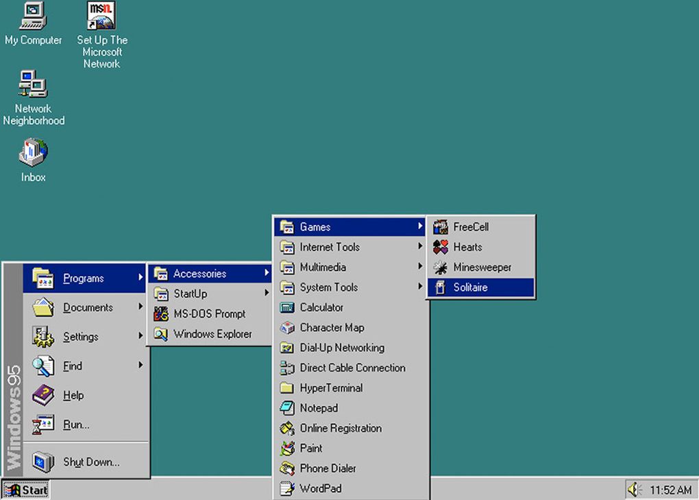
I remember being part of the Windows 8 beta tests and was looking forward to trying it out. After all, I’d been impressed by Windows 7, when it was in beta stage and its release, and keen to see how they’d improve on it. It wasn’t looking too bad to begin with; clean, less glassy, and responsive. Then, one day, a new build came along and the Start Menu button disappeared. The thing that had been synonymous to the OS since Windows 95 was gone. Was it a mistake? A bug? There were murmurs at the time. I believe the general opinion was that it was a mistake and it would later come back. You could still see the Start Menu anyway if you clicked in that area of the screen, so the assumption was it was a bug and would be fixed up. How little we knew what was to come next.
In a later build, the invisible start menu access also disappeared. Replaced by the new tile system that sprawled out across the screen. It was starting to become apprarent: somebody at Microsoft had decided that the tablet experience would translate to the desktop (boy, would I love to have been in that meeting), forgetting the fact that a keyboard and mouse are fair better tools for every day tasks. The confused voices of the beta testers got louder. We asked if would get the option to choose between the old style menu and this new one (that nobody wanted). The answer was no. MS failed to listen to the feedback, from the people actually testing their product, and went all in on Metro… which was a jarring experience as well. Switching between desktop apps and Metro apps, which needlessly took the entire screen, almost felt like using two different machines. It didn’t make for a fun workflow.
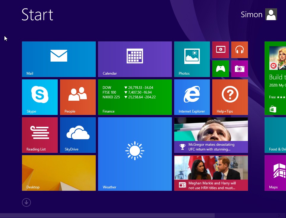
Things didn’t improve as the RTM build got closer. Windows booted straight to the tile screen. To get to the desktop you had to click on the desktop tile. Seriously, a desktop OS that didn’t boot to the desktop. I mean… what? Microsoft hoped people would buy in to their idea of the Metro UI. Instead, most people stuck two fingers up and continued on with Windows 7. And who blame them? Windows 7 was an excellent OS that MS actually got right from the start (well, to be fair, given it was pretty much Vista with a big feature service pack, it ought to have done, really). 7 did everything they needed without the jarring experience offered by 8.
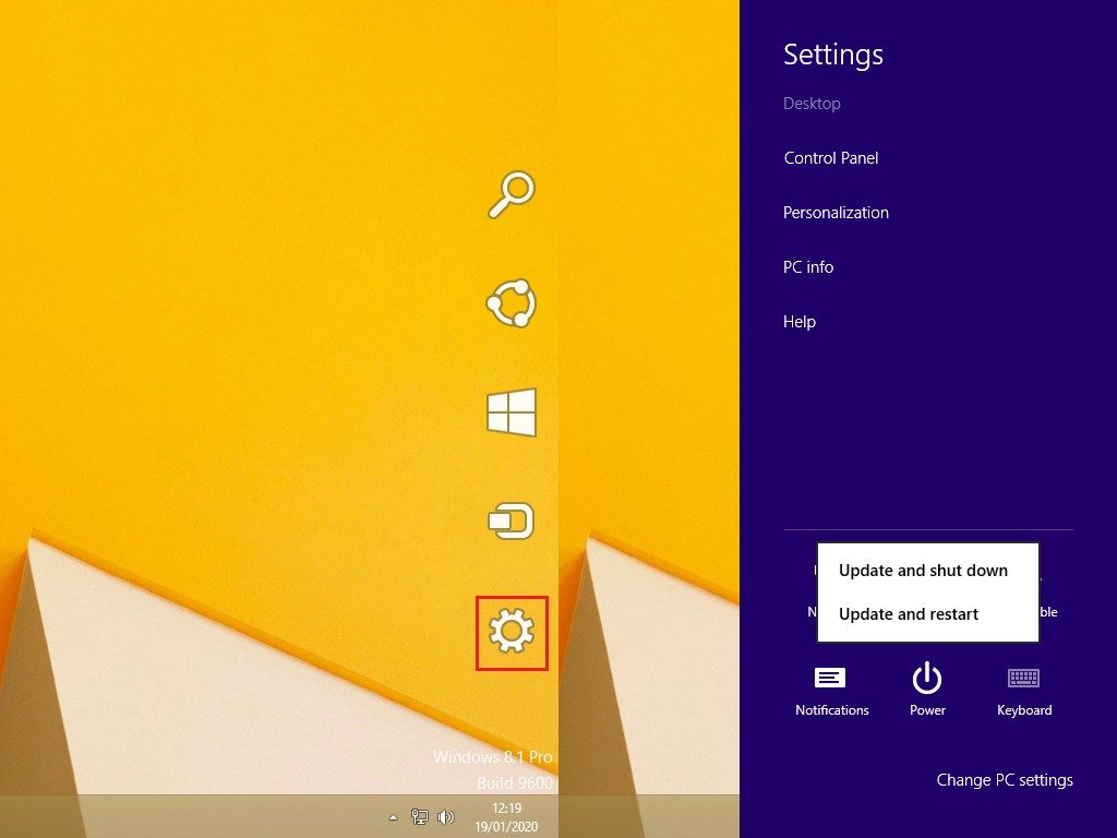
In another bizarre UI choice, MS moved the shutdown/restart options to the right side of the screen. Powering down became a cumbersome slog of hovering your mouse over the right side, waiting for the ‘charms’ menu to appear, clicking on ‘Settings’ then click on Power and finally clicking on ‘Shutdown’. To the unitiated, it was a pain trying to find out how to switch off your machine in the first place. To the trained it was too many needless steps, and not exactly intuitive, to do something that should be extremely simple.
MS also baked both the Metro UI and the charms menu in to it’s Server 2012 offering. Baffling. There’s are reasons Linux rules the server market, and it’s certainly not down to pretty desktop UIs… quite the opposite, in fact.
This era was a weird time for Microsoft, when it came to UI design. Visual Studio 2012 was also released, which replaced the nice, soft, VS 2010 blue theme with an AWFUL, GARISH INTERFACE THAT SHOUTED AT YOU FROM EVERY MENU. Something that MS quickly remedied with it’s 2013 release. Microsoft Office also got a curious facelift, starting with 2008, that wasn’t too well received either.
Windows 8.1: The saviour that… wasn’t.
With Windows 8.1 Microsoft gave a very lacklustre attempt at placating it’s core by bringing back the Start Menu icon. Much was trumped about how they were bringing it back, and we all breathed a collective sigh of relief. However, rather than actually opening the menu, we all know and love, it was literally just a visual cue that still opened up the full screen tile experience. Wow. Really listening to your customers and responding to feedback there. They may as well have put a middle finger on the icon, too. At least the update gave the option of booting straight to the desktop. But it wasn’t enough to stop the rot. Businesses didn’t take to it and stayed with 7 (and many still stuck with XP. D’oh). Windows 8 fate was sealed and MS began planning for Windows 10.
However, all the above problems could be rectified with Start Menu replacements. Programs such as Start8, StartIsBack and Classic Shell could all load up a Windows Vista/7 like Start Menu that did everything, as you remember, and had the power options where you expected to find them. Once you had the ‘classic’ menu back Windows 8 suddenly became an OS I was only too happy to use and indeed, did for a good 6 years or so. Behind that blockading tile menu was an extremely capable bit of software. And that’s the annoying thing. All MS had to do was offer the choice: use the classic menu or switch to the new Metro UI. If third party offerings could do that I see no reason why MS couldn’t. I’d wager they knew nobody would use it, if given the choice, and hence felt enforcing it on people would make people learn to love it. We didn’t. As we told them right from the start. Let that be a lesson in listening to your testers.
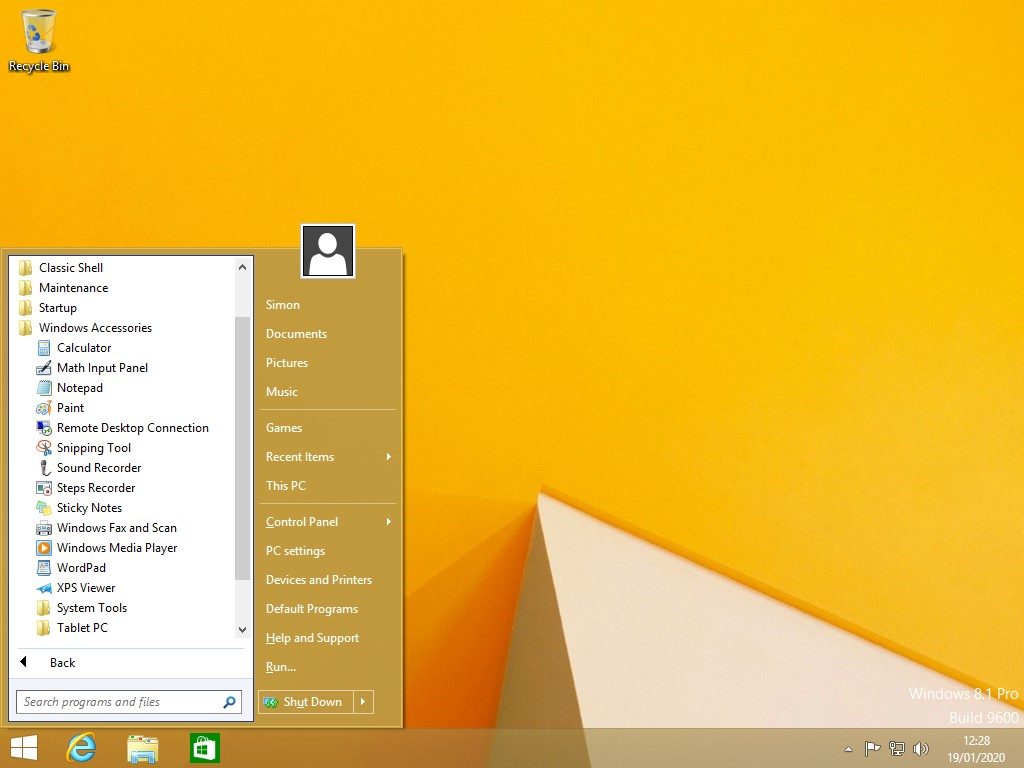
So, Microsoft certainly made a hash of Windows 8, but was it a bad OS? Not really. With an above mentioned program installed, the experience was less jarring, and booted straight to the dekstop. It was then absolutely fine. Just as good as 7, in terms of usability, and had various improvements. Aero had been ditched (I always turned it off in my 7 installs anyway), and I liked the neat desktop UI. There were nice little tweaks for power users, especially the Task Manager. Windows Defender incoporated Security Essentials, so was also a built in anti virus. Someone coming from 7 would be hard pushed to notice the difference, and would have felt quite at home. Wndows 8 sans Metro would have been recieved far differently.
But this is all academic, regardless. The damge was done, right from the off, and it never recovered (I dare say Microsoft’s middle finger in 8.1 played a part in that, as well). Windows 8 for myself and many has been consigned to the history bin. Many will still be on Windows 7, and many more will have gone from 7 to 10. It’s a small notch in Microsoft’s timeline done.
![]()